
13 August 25
Painting In Kodachrome
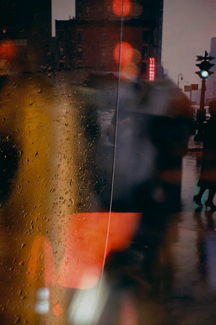 I have recently become acquainted with the photography of Saul Leiter, and am awestruck by his work. It is the most painterly color photography I have run across, and it is not surprising that he was also a painter.
Saul Leiter was born in Pittsburgh in 1923 and was descended from a line of rabbis, his father being a prominent Talmud scholar. Saul’s father wanted him to be a rabbi too, and Saul dutifully went to seminary in Cleveland for a bit, but then dropped out and moved to New York at the age of 23 to try to become a painter. Friends of his encouraged him to take up photography, and he developed a career as a fashion photographer, working mostly in black-and-white. His color work was a private hobby which started in the late 1940s and largely carried out in the neighborhood in New York where he settled in the 1950s and lived the rest of his life. But his color photography started to attract some attention in the 1990s, and in 2006 a book of his early work was published, entitled Saul Leiter Early Color. After that book was published many people got interested in his work, though Saul was quite humble and never comfortable with fame.
Saul died in 2013, and in 2014 friends of his set up the Saul Leiter Foundation to preserve his art and legacy. The photo at right was taken by him in 1958 on a walk in New York. Saul loved working with reflections and windows and raindrops: in a documentary about him completed in 2012 Saul remarked that “a window covered with raindrops interests me more than a photograph of a famous person.”
9 August 25
Photo Cataloging
 I have started in on a project that will take me months to complete but this makes it a good activity for retirement. This project is cataloging all my photographs. I keep my archive of photos in a photo manager called digiKam, with most of the photos organized by year and then by month. I started this archive early in 2017 when I bought a little compact long zoom camera, the Panasonic ZS50, in advance of a trip to Iceland in fall of that year. In addition to organizing the photos by month and year, I also started tagging the photos with keywords and rating them in quality from one to five stars.
I fell off the program of tagging and rating the photos sometime in the middle of 2018, which leaves about a 7 year gap in this process. I have been working backwards to fill this in, and I have completed between July 2025 and May 2024. (I set July 2025 aside, and have just completed it. Because of my photo palette project in July, I ended up with 740 photos for the month, which made it a bear to get through.)
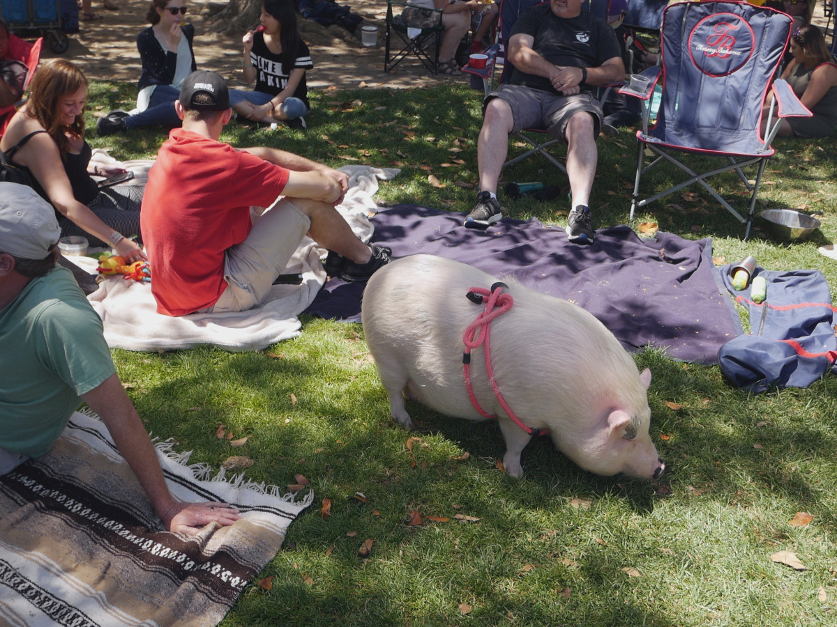
Is this effort going to be worth it? I think so. The rating process is an important exercise in figuring out one’s photographic style and aesthetic sensibilities, and tagging the photos helps a great deal with retrieval. The photo at right is a fun example of the latter. I wondered what I had cataloged under “Animals / pigs”, and came up with several photos of a pig enjoying the Whole Earth Festival in Davis in 2018.
4 August 25
Artists Support the Protests

On Saturday I attended the weekly Freeport, Maine protest against the current administration and its erosion of American democracy with my sister. We grew up in a fascist country and as the gentleman on the left is pointing out (his sign is not very visible), “Remember Germany 1933.” It was a pleasant way to spend a morning but we were all wondering what good it was actually doing… Lots of cars beeped in solidarity; some also shook their heads or worse. This is the point: we agree they have the right to disagree.
This protest coincided with the local arts & crafts fair, and one of the artists offered us all a notecard to thank us for showing up. I went over afterwards and talked with her: she is a farmer whose livelihood is being threatened by the administration’s cuts to the USDA… I loved her work and bought some more notecards. I gave the still life of just-pulled beets to my mother, who loves beets.

1 August 25
The Sketchbook Format Dilemma
As evident by many of my recent posts, I keep a daily sketchbook. Because at the beginning of the year I switched over from sketching buildings on weekends to sketching trees, I started sketching in a portrait format sketchbook (a Stillman & Birn 8.5×5.5” softcover Gamma book), since trees tend to be vertical rather than square. This works well for my weekend tree sketches, which tend to be extended sessions away from the house, but less well on weekdays when I just want to do a quick sketch, and a square format book seems best. My current sketchbook is entirely of plant bits, all of which lie happily on a portrait page. I like the consistency of the theme but it might be time to move on from plant stems. This leads to the dilemma of what format should be my next daily sketchbook. Here are some of the issues:
- A square format sketchbook works well for quicker sketches but is not so good for trees. What would be my next subjects for weekend field sketching?
- I have trouble finding subjects for portrait format sketchbooks that are not plant bits. I suppose there is the vacuum cleaner, water bottles, and the cat tower.
- Landscape format sketchbooks are great for, well, landscapes but there’s too much surface to cover for quick weekday sketches.
- I like the Stillman and Birn Gamma paper but the Gamma softcover sketchbooks don’t come in square format. The Alpha ones do but they are a relatively large 7.5” square size.
- Having a background in 4:3 camera formats (the little Panasonic ZS-50, micro four-thirds cameras), I much prefer 4 to 3 ratios for layout within a frame. I don’t know any 4:3 sketchbooks though.
30 July 25
Daily Sketch - Delphinium
 Today’s sketch is of a delphinium in our garden. There are not too many flowers left on the plant as a whole, and the seed pods are developing well.
24 July 25
Daily Sketch - Prunus
 Here is a sketch of a branch from a small volunteer tree that is growing in the yard on the north side of our house. I’m pretty sure it’s some sort of Prunus, quite possibly Prunus cerasifera ‘Atropurpurea’.
22 July 25
A Photographic Diary
 I recently watched a YouTube video by Emily Lowrey (her channel is “Micro Four Nerds”) entitled “how to document your life with your camera (and WHY!)”. I like this concept and am trying it out. One’s day-to-day life produces plenty of photographic material — look for it and have a camera with you. But the photos should be about what you do in your own life rather than other subjects, however visually interesting they may be. In this vein, I went grocery shopping this morning, and here is my record of that event.
20 July 25
Blues Are Hard
 I have gotten through my project of selecting 7 different picture profiles for my compact Sony camera. As related previously, I went down this rabbithole because the skies in the reference photos of the trees I’d sketch were tinged cyan (see the example at right). I am better off now after finding some good profiles, but Blues Are Still Hard.
To begin with historically, blue pigments have been very hard to come by. Taking one example, until it was synthesized by the chemist Christian Gmelin in 1828, ultramarine was only obtainable by laboriously preparing the mineral lapis lazuli sourced mainly from Afghanistan. (I should read science writer Kai Kupferschmidt’s book from 2021, Blue: In Search of Nature’s Rarest Color).
Next, in summertime here the skies are blue with nary a cloud to be seen for months at a time. Photographically this becomes a challenge because if I’m exposing on a street-level subject, the skies will tend to be overexposed and blown-out. This is not what the eye sees, since the eye-brain has a much higher dynamic range than any camera. In other words, our visual system is quite capable of taking in a bright blue sky together with details in shadows underneath shrubbery at the same time, but cameras cannot handle this.
I sketch using either watercolors or watercolor pencils as my color medium. Here is a different problem. Consider a scene where one is looking through sunlit leaves up into a bright blue sky. The leaves may end up having a lighter value than the blue sky because they are transmitting direct light. This is really hard to paint in watercolor – one can’t do a uniform blue wash for the sky without laboriously masking out the leaves, and then painting the leaves a very light yellow green. Photographing such a scene isn’t much easier because of aforementioned dynamic range problems.
At least I’ve worked out that the best pigment for painting Northern California skies is cobalt blue. This doesn’t necessarily hold for other places in the world.
18 July 25
Daily Sketch - Figs
 Sketched with watercolor pencils and De Atramentis urban gray ink. None of the figs on this tree are ripe yet – maybe another two or three weeks?
17 July 25
Drawing a Postcard
 It’s actually very difficult to find postcards of Davis to send to people around the world through Postcrossing. Often people request “pictures of your town” and there really aren’t any photos for sale here of things like the Davis train station or the Arboretum when the redbud is out. But recently someone I was assigned to send a postcard to wanted a bird, an OWL, and preferably a drawing of one.
I like drawing birds of prey and especially owls. I like giving the suggestion of the softness of their feathers. I hope I did this bird some justice… we have a pair locally; I heard one the other night.