
24 January 05
Apocalyptic Assignment

My calligraphy course in Roman Majuscules continues to throw challenges my way. The latest one is a rendition of Revelation 6:8, the one where the four horsemen of the apocalypse are named along with wild beasts of the earth (which apparently didn’t merit their own horses). Roman majuscules lend themselves to ponderous, serious things, and would be quite unsuitable for, say, “I wandered lonely as a cloud” unless you were trying to pull a Monty Python. (Which Terry Pratchett does, in fact: he has the horsemen scratching their heads over how to play bridge in a bar while Cohen the Barbarian comes along and makes off with their horses. I forget which novel.)
We were to write out this verse in a mixture of 7mm and 15 mm-high letters with the attribution at 3mm; we could choose a left, centered, right, or asymmetric alignment. In these days of desktop publishing programs this is very easy to do in type but when you do it with a pen, it involves a lot of scissors, lettering, re-lettering, and so on; I can’t swear I didn’t futz with the right alignment a little in Photoshop before turning it in.
I chose a right-aligned text, much harder than I suspected, and spent hours working out the inter-line spacing, where the words should be larger, and so on. In the end the lonely word “earth” at the bottom is a reminder that things look pretty bleak out there. But this class is a lot of fun and it’s certainly a lot of work…
20 January 05
Farewell to a Friend
 Bsag over at but she’s a girl was recently wondering how to improve her handwriting. While I was leaving a comment I looked up a reference to Tom Gourdie’s book on this very subject and learned from a Scotsman obituary that he had died on January 6th of this year at the age of 91.
I’m a calligraphy buff. I own probably more calligraphy books than novels. There are the greats and the Very Greats, Edward Johnston and Irene Wellington and Alfred Fairbanks and Donald Jackson, Gainor Goffe and Denis Brown and Thomas Ingmire, Sheila Waters and Julian Waters, Ludovico degli Arrighi and Hermann Zapf. These are the stratosphere people, true artists whose work is inspiring and somewhat terrifying. They are generally a gentle bunch, well the ones who are still alive anyway, but their gentleness doesn’t prevent an aura of solemnity from emanating from their midst and their work.
Tom Gourdie was never like this. You just KNEW. His great project was to improve handwriting in Scottish schools and for decades he devoted himself to introducing the italic hand to children, when he could so easily have been one of the stratosphere people. I never heard him speak but the copies of letters he so generously included in his many, many books show a sensitive yet sensible person, a born teacher, someone you’d love to have over for dinner and then clear the table and get out the ink and the pens.
Clarity for Gourdie was key—in fact I’m sure he’d say it was synonymous with beauty. Any handwriting that deteriorates at speed is useless. In a time when people find it hard to pick up a pen at all any more, this message should be sung from the rooftops. I’d be up there only I have a history of mishaps involving my lower extremities…
4 January 05
New Year’s Resolutions
 I sat next to a young woman on the plane to Chicago the other day. She pulled out a sketchbook even before we were asked to turn off our electronic devices. It turned out she was working through Betty Edwards’ Drawing on the Right Side of the Brain, a book I’ve seen many times but never actually read. During the flight we each drew people we weren’t looking at and our hands as two of the four “pre-instruction drawings”—a self-portrait and a chair weren’t really possible that day in row 24 on the port side—but when I got home I looked for Numenius’ copy, the 1989 edition (there’s a new edition out now).
At left is my copy of Picasso’s portrait of Igor Stravinsky, drawn upside-down, which Edwards claims is the fastest way to disengage left-brain activity.
Among all the resolutions I haven’t quite formulated for the new year but which hang in the background as nagging perennials such as eat better exercise more get a better handle on the cash flow, draw more is one that feels like an invitation. Draw more of here.
Ecotone has been sadly bombarded with spam but this is my entry for the New Year.
20 December 04
Prometheus Again
I once tried to paint in oils and egg tempera a painting of Prometheus. My titan was gaunt and almost skeletal, quite unlike some of the renderings I’ve seen of him as a buff gay icon. He faced the viewer in horror as his back was turned to the approaching liver-snatching eagle, which I modelled on the steppe eagle rather than golden. I’d gotten through about three or four glazes before I decided to give up—the drawing was wrong, especially of the man.

The reason I’m thinking about Prometheus again is because of the liver connection. Today I chanced upon a contemporary artist, Elsie Russell, who has clearly put some time into this subject.
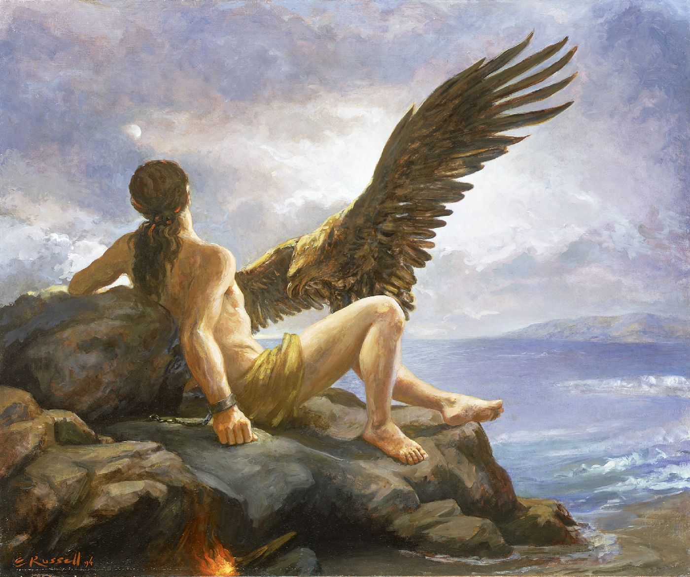
I’m always enchanted when I find artists working today who have a) some grasp of drawing and anatomy and b) an interest in their historical artistic and cultural heritage, along with the talent to explore these in a new way. It’s possible in some cases to write this off as postmodern trendiness, though why that’s worse than modernist trendiness I’m not sure. (Notice that a lot of the artists who rail against drawing well, calling it “illustration,” are the ones who can’t draw for beans, like David Hockney.)
Classical myths endure because they tell us something fundamental about the human condition. I suppose I’m entering a phase where I’m willing to try and work out what this particular one might be for me. Regeneration? Endurance? Being punished for doing the right thing or for knowledge? In this dark time of the year in the northern hemisphere, images of light are particularly appealing to me. In this dark time we are entering for the world, how much more appealing they become. How much more worth the defiance of authority, even when those who benefit from the great act are unworthy or worse, ignorant.
Liver. Live. Love. Fegato. Fe. Foie. Foi. Higado. Hidalgo.
Live.
19 December 04
The Scourge of Arial
A brief history of the parasite font that dates from around 1989. There is also a sidebar highlighting the differences between Arial, Helvetica, and Monotype Grotesque 315, Arial’s ancestor.
14 December 04
Letters of Complaint
 Inspired by Natalie of Blaugustine’s recent complaint regarding some boots she’d bought that didn’t, um, work out, I decided to send in a letter of complaint to Canson, a French paper manufacturer whose American subsidiary is based in South Hadley, Massachusetts.
 The substance of my gripe is that some layout bond paper I bought for calligraphy is defective, or rather every other page is. This every other page bleeds when ink is applied. I won’t go into the paroxysms of how this feels when you’re trying your hardest to render the perfect Roman capital “Q” and it fuzzes out like wine on cotton wool, but basically I’m not happy. I have suggested in my “letter,” above, that this might have been a fluke, a bad pad of paper. I’m not going back to Berkeley to try to return it; you can’t buy this stuff in Davis or even Sacramento.
My hope with such a missive is that they’ll fix it, or at least be aware that we’re going to notice if they start cutting corners, quality-wise. At worst they’ll throw it in the bin, but I’ve been gentle: maybe they won’t.
Maybe, Natalie, they’ll give me store credit?? Hah.
8 December 04
Ephemera
Growing up in Madrid in the 60s we traded these things called cromos—cards that could be stuck in an album, but only across the top, so you could lift them up and learn all about the item depicted in the image. I don’t even remember what the theme was (probably the natural world), just how Desirable they were, huge swaps going on in the playground with giant stacks of cards, shady deals and so on.
I must be the last person on earth to hear about Artist Trading Cards, which were started by a Swiss artist in 1996. The idea is to hand make an edition of twenty cards or so and send it in, and you’ll get fifteen different ones back. This is a strictly non-commercial unjuried art show, part of Copy Left, intending to get artists to meet each other at Events and subvert the corporate hold on art. At least that’s the impression I get from a random look at the Gallery.
There is no such Event anywhere near here soon, but I might send in a set to Sister Trading Cards. I make such things often in any case: for me it’s part of recycling what’s lying around. Having it make sense on a 3.5” x 2.5” card is a new challenge.
2 December 04
Different Paths
I’ve been taking an online calligraphy class, my first. Roman Majuscules. The ones on the Trajan Column, beautifully proportioned and fiendishly difficult to do well—the basics are easy but everything, EVERYTHING is in the nuance, the subtleties. It requires a lot of practice.
The time I have to practice is early in the morning. This is also the time when I might be writing or meditating, and in practice it ends up being the time when I everyone else’s blog over several cups of tea. And get ready for work, having eaten breakfast. And taken a shower. And am late for work. And so on.
Meditation’s not easy for me; I am easily distracted and the thought of a week of Zen practice, let alone longer, is inconceivable (Lorianne has my admiration no just because she wrote a 50,000-word novel in the month of November…). All the uncomfortable sitting, thoughts whizzing through my brain…. Yet this morning as I patiently dipped the pen in the ink, strove for the 30 degree pen angle (but 60 degree on the verticals of the “N,” 20 degrees on the “Q’s” tail and the upper diagonal of the “K,” 0 degrees on the diagonal of the “Z,” I pondered on what a meditative exercise it was. Family groups, organized widest to narrowest; then the alphabet; then abecedarian sentences (I gravitate mostly to those in Latin, like “Trans zephyrique globum scandunt tua facta per axem,” which nonetheless leaves out “K” and “W” as well as “V” which should replace the “U”). Finally, I decided to try Michael Nagler’s suggestion of the prayer of St. Francis.
 There is no way to write these letters quickly. They build stroke upon stroke, over time, and the space between the strokes is as important as the shape of the letterform. They get absorbed, penetrate the psyche. It’s pure concentration: pure present.
Lorianne says a Trappist monk once told her Catholicism had lost sight of its contemplative roots. I’d like to think the invention of the printing press had a tiny part in that….
Since this photo gives a rough sense of what the rest of the house looks like, and the reasons I find to avoiding doing housework, this will serve as an Ecotone Wiki entry—this time it’s Housekeeping and Place.
21 November 04
Davis SketchCrawl
 We spent part of the day today participating in the worldwide SketchCrawl. After warming up with a few kitty sketches, we went out to breakfast at Caf Bernardo, where we sketched the pancakes, waffles, other patrons, and the condiments, as in Pica’s sketch at left.
We then went back home, walked to the creek, hoping to see salmon but no luck, and then walked on to Pica’s office, where we sketched horses and ground squirrels: my sketch is at right.

We finished up our sketching outings at Mishka’s, where we enjoyed hot chocolate and tea.
10 November 04
Rivers
qb of Frizzy Logic went to meet Natalie of Blaugustine and bought a picture this week. There are tantalizing glimpses of them, not quite straight-on. I was mesmerized by their accounts and images of this encounter, and by Natalie’s art.
The next day I got a note from another artist friend in the UK, Brian Pike. We knew each other back when he was a graduate student in philosophy at Cambridge and I wasn’t. His topic was enthralling, though: human color perception. I argued that different cultures had a different sense of color. He didn’t think so: he said if I asked a Yanomami indian to point out their reddest red, it probably would be pretty close to mine. oh, I said. (I said this a lot when I lived in Cambridge.)
His route to becoming an artist was complicated, but I for one am so glad he did.
 From the hauntingly spare images of lonely houses on Yorkshire moors to monkeys in Tamil Nadu, whose texture is only whispered across the continents at 72 dpi, I want to go buy a picture, too. I want to show up on his doorstep and have a cup of tea and plunge my face into these images that remind me of something I can’t quite remember. He says Paul Klee is the most important artist of the 20th century. Not Kandinsky, I’d say? There would be chocolate biscuits.
(I guess I’m pining for Yorkshire. People who know what Yorkshire’s like in November will probably think I’m nuts, though Coup de Vent seems not to mind.)
Brian’s art has kept us in touch, I think. And I wonder how many other friends I had who could have done something this but chose other, perhaps easier, ways, with whom I have now lost all contact. Like with Natalie and qb, the images jump, shortcircuting language. I love words. But I love breathing through my eyes, too, having this other river that flows through my soul.