
25 February 07
Sudoku Pencils and Friends
If you’re getting frustrated with trying to solve Sudoku puzzles maybe you need a pencil specially designed for the task. This site Pencil Things sells everything related to the writing implement. Who knew that you could buy plastic caps to protect pencil points?
11 February 07
Clones
When I worked for an architectural firm in Cambridge, Mass, in the late 1980s, a lot of the young architects had studied at Harvard. They had survived the gruelling critiques by the then prima donna, an eccentric Argentine called Jorge Silvetti (“Jess: but it is veddy veddy oggly”) and were coming to terms with churning out HVAC (Heating, Ventilation, Air Conditioning) systems rather than designing the masterpieces they were probably all capable of but would never have the chance to do, because architecture is highly political and without an in to where the money was, their work was doomed to oblivion. They were affable and seemed resigned to the huge student loans they’d struggle to repay for decades.
They taught me a lot, though, these talented designers, apart from the late 20th century Boston vernacular and how to play softball. (And, incidentally, how to love the Red Sox.) They taught me that you could tell that someone had studied graphic design at RISD, the Rhode Island School of Design, simply by looking at their portfolio. (You can use any typeface as long as it’s Helvetica.) I later came to learn that you could tell any calligrapher who had been active in Portland in the 1980s: styles coalesce regionally around one or two top practitioners.
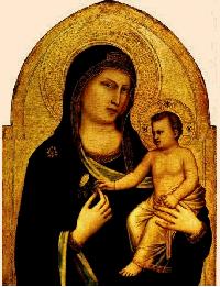 There is nothing inherently wrong with this: it’s been going on a long time. The eyes of figures in Giotto’s paintings are what they are because of where he was and who he sipped wine with, as much as who taught him how to paint and his own genius. Early Renaissance Sienna brings to mind a certain look. There were the masters and the students, but there’s an identity inherent in the school.
How this is different from a disturbing trend I’m seeing now in book arts is hard to pinpoint. But the way, now, the de rigueur way to make an artist’s book, is this: you take all your pages, you smother them with acrylics (leave no white space visible, on pain of being labelled facile); you then take vintage photographs, which you cut up in “disturbing” ways (hands; feet; eyes) and paste onto your acrylic ratatouille, and then you paste arbitrary newspaper clippings on top of that and other clip art and maybe some rubber stamping and slather some more muddy acrylics on and there you go, you’ve made some art.
Except for this: all of these pieces are identical. They will be found 100 years from now and someone will say “Scrapbooking School, ca. 2006, artist unknown.”
Will someone please explain to me a) how this happened and b) how it’s just a fad that’ll over by next Tuesday, please?
9 February 07
January Drought Over
Our ditch is full of water. Today’s supposed to be rainy and very windy. I’m heading into Sacramento with some friends to go to the Crocker Art Museum. We’ll be sharing the road with about 2 million other people who, deprived of snow during the month of January, need to make up for lost time. Many dollars will be transferred to orthopedic surgeons this weekend…
A trip to the library last night: Danny Gregory’s Creative License was in the new book section! If you’ve never drawn anything past the age of five, or if you have but got discouraged by comments from teachers or peers or parents or siblings, pick up this book and pick up a pencil (or, even better, a pen, the easier to free yourself from the tyranny of the eraser). I promise you, you won’t regret it.
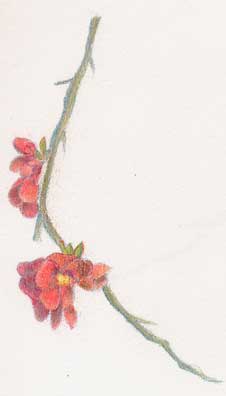 When I sit and sketch or draw — on a curbside, as on Sunday next to a spectacular flowering quince while most of Davis was watching the Superbowl — I get so absorbed I go into a sort of trance. About five people I knew walked or cycled by while I sat there, and each time I looked up at them with a glazed expression, not helped by the fact they were mostly backlit by the sun, apparitions, almost. There is no better therapy for me. The overwhelm of the sumptuous color, the figuring out its complement in order to render shadows (for this coral, turquoise); the sexual pumping of the bees, never sated, plunging themselves again and again into the heart of every blossom; the audible yet still invisible arrival of an Anna’s hummingbird, displacing the bees momentarily from their copulations with flowers, finally peeking at me through twenty spikey stems: bliss. Whether or not the drawing or sketch is any good is almost irrelevant: the act of sitting, slowing down, really looking — it’s probably the closest I get to meditation.
I’ve been finding lots of good sketching and drawing blogs lately. Making a Mark is eye candy for devotees of the colored pencil, and the current collaborative online Van Gogh project Katherine’s involved with is definitely worth a look; Lori over at Chatoyance sketches freely, passionately, capturing wonderful expressions (which, of course, is all of them: when you’re working with people, every piece of them becomes an object of wonder, worthy of attention); I receive Julian’s Postcard from Provence daily; Aussie calligrapher Graham McArthur has a spectacular blog, Eidolon. Trumpetvine Sketchblog features Martha’s incredible instructions on how to eviscerate a Moleskine planner and turn it into exactly the kind of sketchbook you want. (We ran into Martha at the December San Francisco Sketchcrawl and got to see this beautiful creation in action.) Illustration Friday grows each week with more and more participants.
 Grab a sketchbook: everything’s fair game. Next worldwide Sketchcrawl: Saturday, March 17. I’ll see you out there. (Or inside: today’s not such a good day for outdoor sketching here in Northern California.)
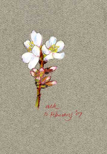
PS: At right is an almond blossom I drew for Jennifer, whose birthday is today (February 10) and who is dealing with freezing temperatures in Sweden: Happy Birthday, dear Jennifer! The original’s on its way…
3 February 07
Further Adventures in Colored Pencils
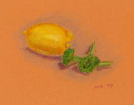 My Derwent Coloursofts arrived this week. A beautiful set of 72. I decided to avoid intermediate quantities based on reviews by Bob and Katherine.
I’m quite familiar with how Prismacolors function. There are some super-creamy ones, such as Indigo, Canary Yellow and Tuscan Red, that glisten off the pencil onto the page; others, such as Vermilion Red, seem to have been made with micah and won’t leave a trace on the paper without a lot of effort, without almost scrubbing the color into the paper.
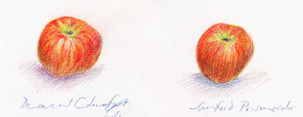 The Coloursofts are, in general, much chalkier than Prismacolors, but are very smooth. Their waxy bloom is slower to grow. The result is a little brighter (see apple on left as opposed to right).
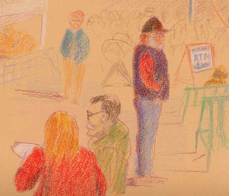 I tried working at the Farmers’ Market this morning. A drawing of this size takes a long time, and people were constantly moving in and out of view, barring the cooperative gentleman in the black vest. It’s better to have an obvious sitter or obvious photograph to work from.
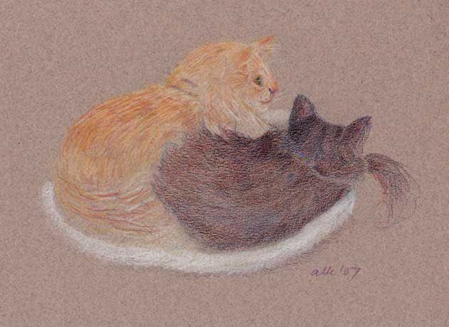 The cats, on the other hand, spend a long time in each position. I was able to do this drawing this morning, in Prismacolor. Black cats are hard to draw and this black was a combination of indigo and tuscan red with a little burnt sienna thrown in. (The warm colors are on top as the cat was close to me, not further away, in which case I’d have done the routine the other way around.)
This sort of discussion seems so arcane when most people around me are talking about megapixels, digital Nikon lenses, and the need to buy external hard drives. I am pondering relative softness of leads and the long, slow, buildup of layers. It’s a different world.
(Note: all the paper used for these drawings was Canson Mi-Teintes, wrong side.)
24 January 07
Aural Calligraphy
 In my two tries so far I haven’t made a Morse Code contact yet. One thing that I’m sure will help is practicing my sending — my calls out now probably sound like complete mush. I have a practice key which sounds a tone when I press the key. What I do is hook it up to the computer and record it using a sound editing program. (I use Audacity which is free and open source.) The program is nice to use here because not only can I replay my sending I can also visually look at the letterforms. It becomes quite clear when I am for instance holding the final “dih” too long in the letter C (dah-dih-dah-dih). More than anything the process feels like learning to do calligraphy in sound, in time.
Above is a sketch of my practice key. I have been doing many of these brush pen sketches lately using Pica’s walnut ink.
13 January 07
Sketching Outing
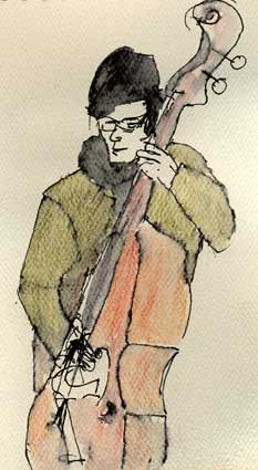
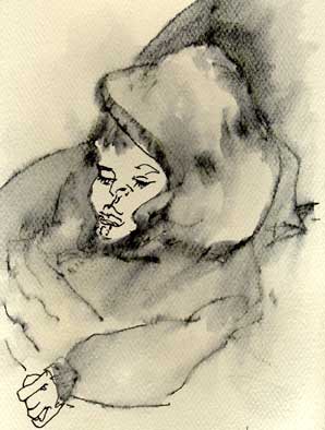 So, so cold last night, but not as bad as it might have been. We met up with some friends at the Farmers’ Market and there were Chicken Tractor, a local bluegrass band, freezing their fingers off. One young aficionado couldn’t take all the excitement.
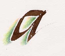
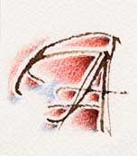
I’ve been doing some more playing with colored pencil outlines for letters (below and also here).
8 January 07
Colored Pencil Odyssey
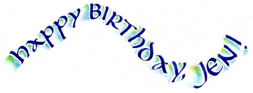 Long-time readers of Feathers of Hope will know that both Numenius and I like watercolor pencils. I also like non-soluble ones and have a large collection of Prismacolors. Sounds like there are others I should try, but for now, I have penty to be going on with.
The idea here is to use colored pencils to “sculpt” letterforms and areas around them, following an article I read in the latest issue of Bound and Lettered.
I’ll post some results here soon, but [Images uploaded 1/11/07] for now I’m having a great time experimenting with color, shading, texture. It’s not just a medium for children…
21 December 06
Feld Hell and Friends
Last Friday marked a momentous event in the history of ham radio — the FCC declared that knowledge of Morse Code will no longer be necessary in obtaining any level of ham license. This move has been long forthcoming, especially since many other countries in the past few years have abandoned the Morse requirement. My initial reaction to this news was a bit of guilt, followed by relief: my campaign to learn Morse Code has gotten sidetracked these past few months. The FCC decree goes into effect 30 days after publication in the Federal Register, and from that time on all I’ll have to do is pass a multiple-choice theory and practice of operations exam to get on the air on the high frequency bands (30 Mhz and below).
What I’m immediately interested in is some of the digital keyboarding modes. These take advantage of the digital signal processing capabilities of modern computers’ sound cards. One hooks up the computer to the audio input and output of the transceiver, and types away at the computer to send digital signals over the air. The advantage of these digital modes, and for that matter Morse Code, over voice is that they work very well with weak signals.
There are many of these digital modes in use — some new, for instance PSK31, which has gotten quite popular, dates back to 1999, and some quite old. One of these, Hellschreiber, goes back to 1929 in Germany. It is essentially a fax mode, where one transmits an image of the text one types out, the characters getting encoded into a 49-pixel matrix. It was originally used over landlines and over radio, the latter version termed Feld Hell (Field Hell).
The name Hellschreiber comes from that of the inventor, Dr.-Ing. Rudolf Hell, who turns out to have had a very long and interesting career. He died in 2002 at the age of 100. He eventually got interested in typesetting, and in 1964 invented the first digital typesetting system called the Digiset. His company in 1990 merged with Linotype to form Linotype-Hell AG, a corporate name which seems to have lasted until 1996 when Heidelberg took them over and spun off Linotype as a subsidiary.
8 November 06
This Pen is No More
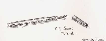 As I’ve said on these pages before, I have many fountain pens; each one is a favorite in its own right. A gunbarrel gray Mont Blanc I bought in Cambridge, Mass, in or around 1993 died today, the victim of negligence as it dropped out of my hand.
I’ve dropped this pen before, always lucky it didn’t fall straight onto the nib. It has a very loose cap, and attempts to fix it have only made it worse. But today, I can only blame my clumsiness.
Oh the agony.
This pen’s qualities: wrote like butter. Nib fine but not scratchy. I had just written about 550 words of my novel with it. It seemed to be liking the voice of Willie, one of the twin brothers in love with my heroine languishing in a Confederate prison in Richmond.
I didn’t take the pen anywhere because of the loose cap, so it became my stay-on-the-counter pen, the one I wrote with in my journal over the years. It paired perfectly with Clairefontaine. We made a morning triad.
In case you’ve been asleep all day, the Democrats took control of the House and, now, the Senate. On a day when I might have been in mourning for a tool I’ve used a great deal over the last fifteen years, a pen so lovely it has felt like an extension of my hand, I’ve felt little but euphoria.
It is a bittersweet day, though, at the end. RIP, dear friend.
5 November 06
Saint John's Bible Revisited
Our friend Father Ed from our days living in Santa Barbara is visiting here overnight — he flew out from his home now in New York to perform a wedding up in Placerville. After sharing vacation sketches and photos (ours of New York and Europe; his of Alaska and the Boundary Waters) we somehow started talking about the Saint John’s Bible, the amazing calligraphic creation that I was fortunate enough to see in exhibition last summer. So we watched the DVD I got last year about scribe Donald Jackson and the creation of this hand-illuminated bible. Looking at the project’s website, I can’t tell how close the project is to completion, but happily for Father Ed, there is an exhibition of folios of pages from the Prophets volume currently showing in New York. For anybody who is in the area, it is well worth going to — the exhibition runs through November 27.