
4 September 25
Videolets
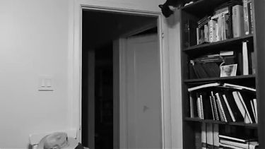 I have been continuing my project of cataloging all my photos, and have launched into the subproject of organizing the video snippets I have. Video baffles me a good bit, coming from a background in still photography. There are many situations where a bit of video captures a subject or a scene much better than a still photograph — think of imaging a river at full flood — but such snippets even if edited together don’t make for a full-fledged video. Or to put it another way, if YouTube videos are the dominant force in video production these days, they are rhetorically a very different medium from still photography even if the stills are augmented with a bit of video.
Maybe the way forward is to embrace video snippets as their own art form — let’s call them videolets. These could work well in a blogging context, for one thing.
In this light, here is a videolet of Winston making a big leap. At night he likes to sleep on top of the bookcase in my office. But he usually takes a shortcut to get down from the bookcase!
1 September 25
From Guinea Pigs to Hummingbirds
 Yesterday was the last day of August. I had promised myself to complete a (rough!) first draft of my Mister Ginger comic by the end of the day, and I more or less did.
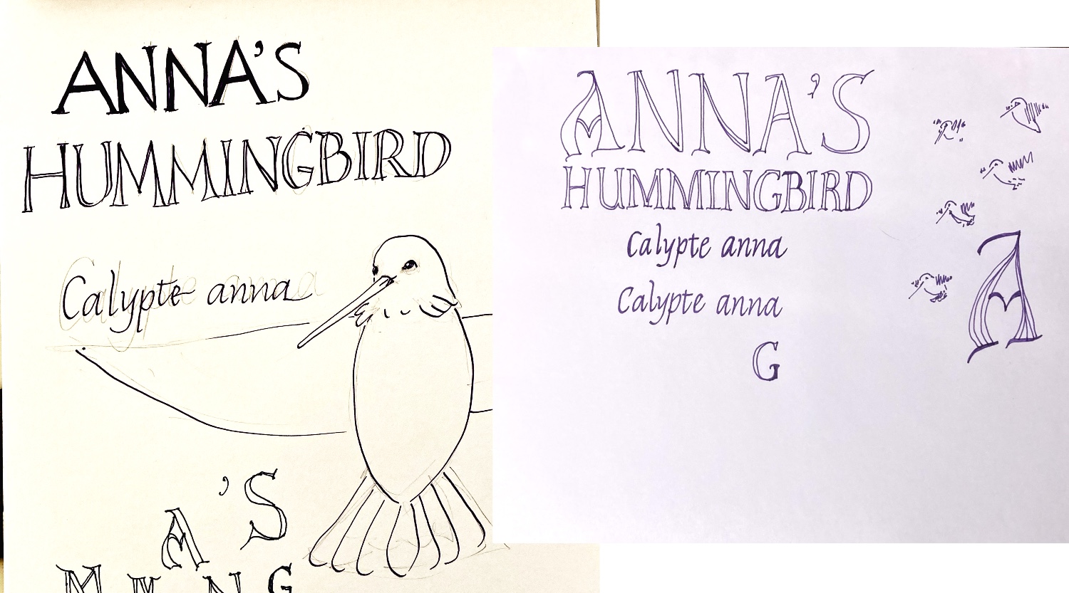
I now have a new task, one whose deadline is September 24th. I’ve been invited to submit a 6-page comic for another SAW anthology entitled Field Notes. I’m going to take some of the hummingbird drawings I did and arrange them thematically on six pages. This book is going to be even smaller than the last one, so my plan is to have one large panel per page.
At left is some of the doodling I’ve been doing for the title page. I am toying with versals. Since I’m going to be working at least at 200% I was playing with larger paper, which is definitely a challenge.
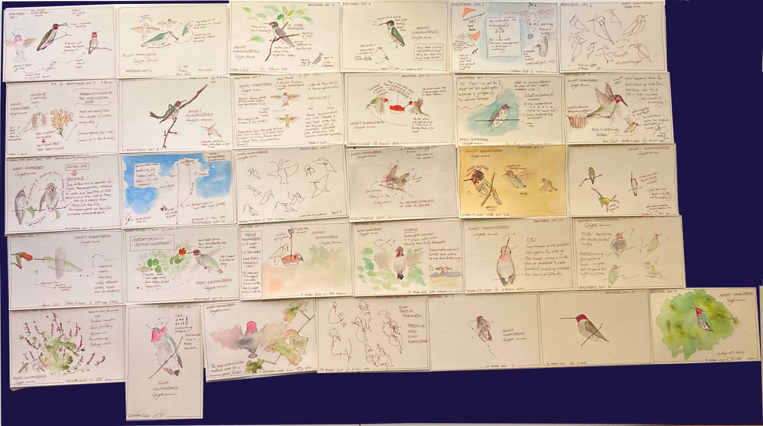
Below are the postcards I painted last Birdtober from which I am drawing the material for this comic. Nice to have most of the research for this project done and dusted.
31 August 25
Metro Systems That Ought To Exist
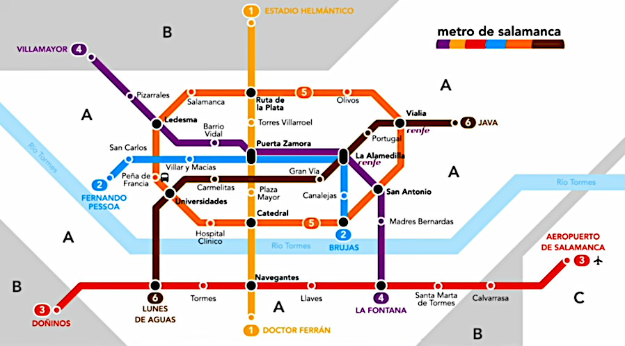 Metro systems are one of the great urban inventions but unfortunately there seems to be a minimum urban size before they get built. That doesn’t mean they can’t be designed in imagination. A YouTuber by the name of Helio Roque has started a project entitled “planeando metros que no existen” and has designed three of these so far, the cities being Badajoz, Salamanca, and Benidorm. Here he presents the creation of his map for Salamanca.
30 August 25
Sailor Fude
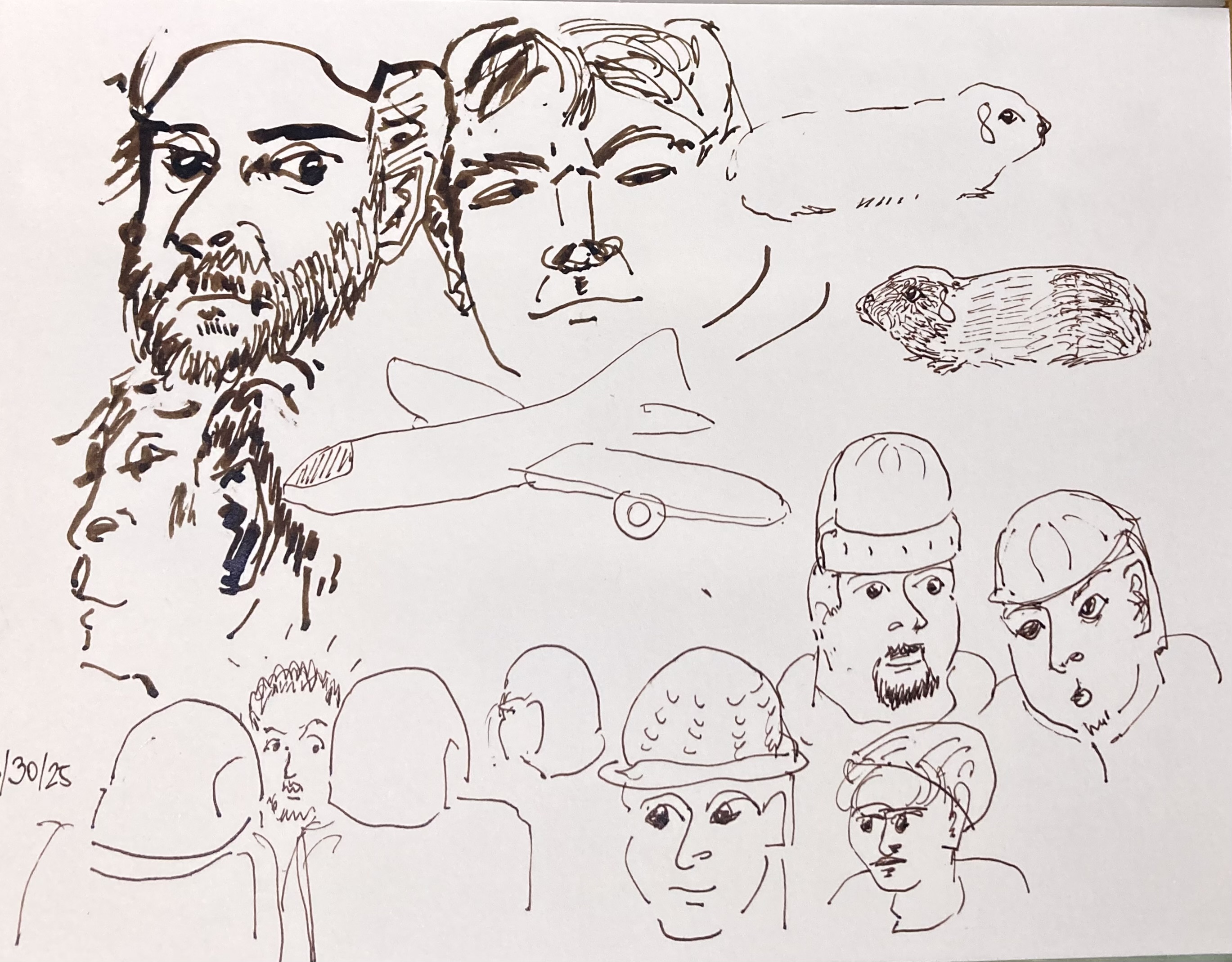 I’ve been working on the ancillary characters of the Mr. Ginger story. Slavic people tend to have round faces and large eyes. This is a gross oversimplification but I was looking for faces online that I could draw quickly to try and approximate this.
Because I’m going to be working at double size, I needed a thicker line than my Pilot Metropolitan could give me. My Sailor Fude pen has a bent nib which allows for four different line weights. Working on hot press watercolor paper is hard — the ink needed a bit of coaxing — but I like the effect. It’s sort of cartoony without my intending it to be so.
I will also be trying Bristol board but I’m thinking this might work well. Still unsure about whether to hand letter the text. (Or whether to hand letter it, digitize it, and set it that way…)
28 August 25
Flow
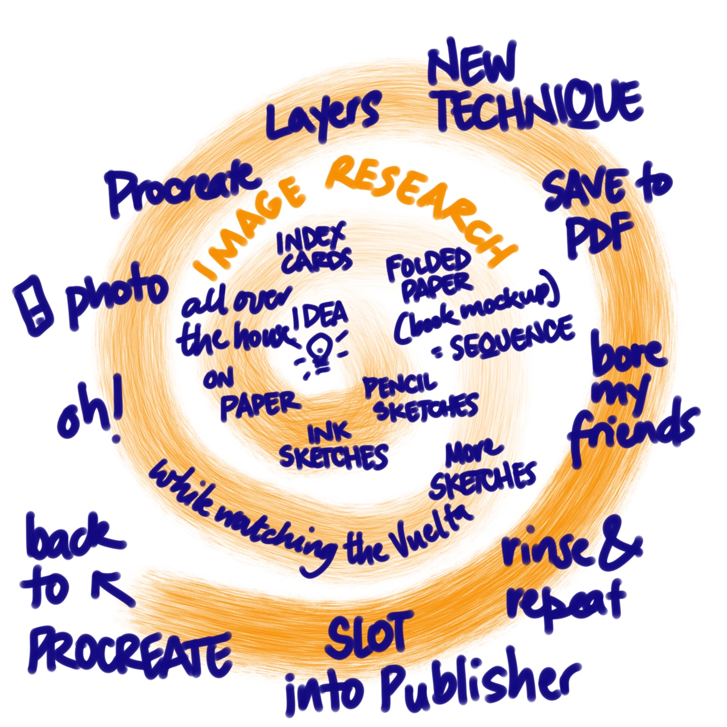 A prompt from SAWgust yesterday was to depict our Flow, our Process. This is my attempt to depict mine. It’s not very efficient.
I’m trying to get as much done as I can on Mister Ginger before Sunday night, and it’s slow. Paper is definitely faster, but if I do it digitally it’s a lot easier to edit. It doesn’t mean I don’t have bits of paper all over the house.
One thing is, my deadline is self-imposed. I have no idea what I’m doing with this thing other than giving a copy to Mister Ginger’s former owners. But I do have time to get this right, or as right as I can.
27 August 25
The Soul of an Egg
 The Vuelta a España finally arrived in Spain today, with a team time trial that circumnavigated the small city of Figueres. Figueres is famous for being the home town of Salvador Dalí, and also the site of a museum dedicated to his works, designed by Dalí himself. The team time trial started at the museum itself, and we were treated to many helicopter camera views of the museum, which in good surrealist fashion has a set of giant eggs on the roof.
Egg sculptures make for fun landscape art. Here in Davis on the university campus, there is a series of egghead sculptures by the sculptor Robert Arneson. The photo here shows a pair of eggheads entitled “See No Evil/Hear No Evil”. These are situated between the administration building and the law school, and neither of them have ears.
Figueres and Davis are not the only places in the world with egg sculptures. In a bay by the village of Djúpivogur in Iceland, there is a set of 34 giant eggs on plinths paying homage to the nesting birds in the region.
24 August 25
Happy Birthday to Me
 Yesterday was my birthday. I’ve been thinking about the lettering for my Mister Ginger comic and don’t have a satisfactory italic nib. This pen writes like butter and I think it was a great choice!
 Numenius gave me a gift, a way to get us through some very troubled times. Keep your claws sharp….
20 August 25
Material
 The good folks at SAWgust have been providing prompts daily to get us thinking about our process. I’ve sometimes answered prompts but I’ve ALWAYS thought about them; they’re very interesting. Today’s was #material: what materials do we use and why? I decided to draw it on one of my materials that isn’t pictured here (Procreate on my iPad). And it’s all from memory, since Winston was sprawled across the kitchen table where these materials all are.
Last night I had a call with Mr. Ginger’s owner, and hoo boy there is a lot more to this story. Good and bad. The good: Mister Ginger is still alive and well and living in Kharkiv (and he has a girlfriend); the bad: this has been traumatic for him, retelling this story for me. But A. did say that he thought Mr. Ginger helped him through some very hard times, which is great to hear because it’s the actual punchline — simply giving comfort to people in a war zone is heroic enough.
18 August 25
Matching the Medium to the Message
 On Saturday I attended the SAWgust halfway point call. I had a question about how others organized their composition process if the final was going to be analog; mostly I work on paper then go digital. But for this Ukraine project it seems analog is a good way to go.
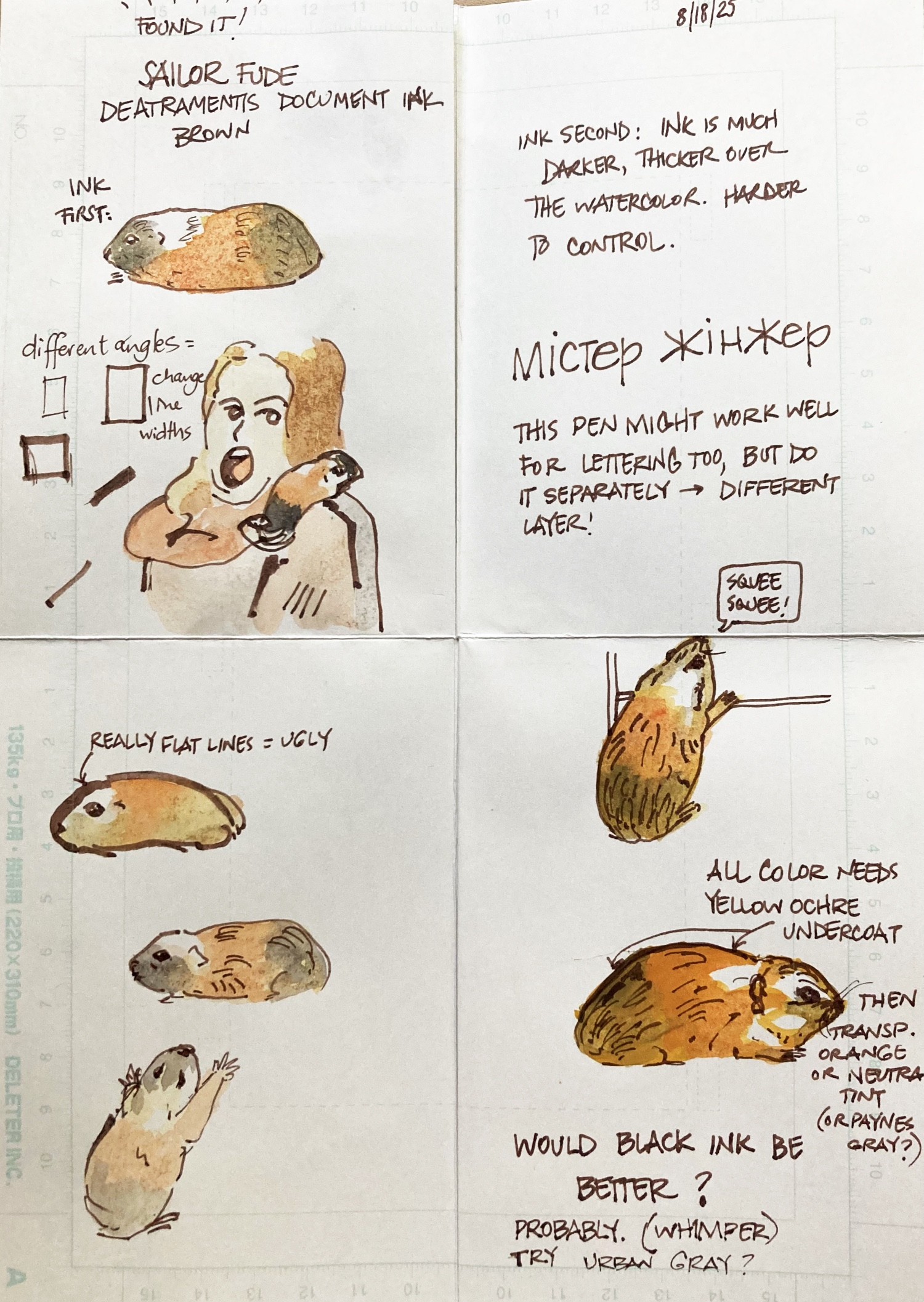
I’d done some sketches with a fountain pen but it has a fine nib and when reduced down it maybe too fine a line. I looked for and found my Sailor Fude pen, a fountain pen with a bent nib that can give you at least three different thicknesses. I think I can get this to work. I still have some fine-tuning to do but am pretty set on this course.
Someone said they just redrew and redrew panels until they were right. Someone else said when using watercolor they used a camera rather than a scanner. Another helpful suggestion was to write the names of the materials, paints, brushes and pens on the back of the work so if you revisit it a year later you have some hope of matching it.
Meanwhile it’s looking like I might do the whole section before the invasion in full color, moving to monochrome afterwards except for the guinea pig… The paper is Deleter A Comic Book Paper size B5, which is not as thick as Bristol board, takes a good wash, and is very pen-friendly.
17 August 25
Daily Sketch - Young Oak
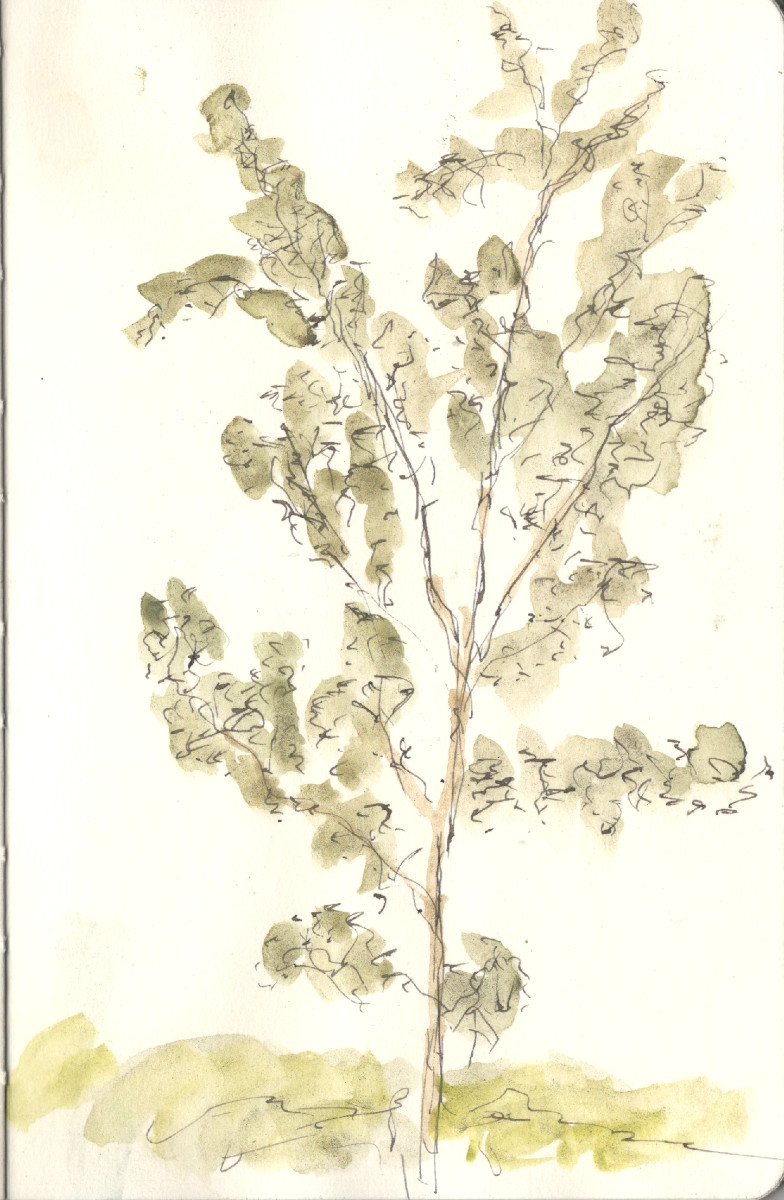 For today’s weekend tree sketch I ventured out on bicycle to the local arboretum where to no surprise there are many trees. I sketched this young oak with De Atramentis Urban Gray ink and used Derwent Graphitint pan paints for the wash. I like the Derwent Graphitint pan set a lot. The principle of the Graphitints (both in pencil and pan paint form) is that they are watercolor pigments mixed with graphite particles which mutes the colors a lot. Using the pan set I find I can mix a lot of realistic greens, and muted sketches work well at times.