6 February 05

3 February 05
Canson Replies!
On December 14 I sent a letter of complaint to Canson paper in South Hadley, Massachusetts.
Today I got a reply along with six different gorgeous pads of Canson Mi-Teints. Apparently the pad of layout bond I was using was an aberration (I suspected as much—their paper is usually fabulous). In addition, I was suspected of being a former Crane Paper sales representative (I’m not, though my step-sister-in-law’s partner is related to the Crane Paper people, I’m not sure in what way). In any event I was asked to consider that if I were interested in submitting “some of your projects for consideration for display at Canson trade shows we would certainly welcome this.”
Not bad for a morning’s fulmination which was far more fun than anything else… make art, not war, should be my new motto.
31 January 05
Soup Precursors
 We had vegetable and garbanzo bean soup this evening, into which went these kohlrabis.
30 January 05
Catching the Moment
Last night we watched Le Mystre Picasso (1956) by Henri-Georges Clouzot. Picasso created 20 images—paintings and drawings in ink on a transparent surface—that were captured on film on the reverse side. It was an extraordinary performance. Picasso’s gestural faces, for instance, are breathtaking, as are the calves of middle-aged men and pointy toes of bullfighters. He worked very quickly but would just as quickly rework something that he called “trs mauvais”—a complex beach scene complete with water-skier and couple in moonlight which still had the original strong compositional lines he started with. Most of the works were destroyed after the making of the film.
I first saw Guernica in the Museum of Modern Art in New York in the late seventies. It is a huge, impressive painting, and it was given appropriate attention and weight and pomp. Franco had already died by then and you knew this painting was heading back to Madrid; through who knows what legal wrangles, it finally did get its own entire gallery (the Thyssen-Bornemisa, now housed in much larger digs across the Paseo del Prado), shown along with sketches displayed in a darkened antechamber, people whispering about it, the forbidden suddenly in their midst.
Numenius and I saw it in December 2003 at the new Reina Sofa museum in Madrid, across the boulevard from the Prado. It seems to need more elbow room than it has. There was a huge crowd around it. For all this, the painting has lost none of its searing power. These gestures: he must have painted them thousands if not millions of times, the eye with tears, the fat four fingers, the pointed howling tongue. They return again and again in his work.
Guernica speaks against the horrors of war. Against Franco’s, against Hitler’s, against all war. Against the senseless brutality that is the result, always, of war.
Who will paint the horrors of this one? Who will write the book? Who will compose the music? Or do the din of it all and the fatigue make such a painting, now, an impossibility?
24 January 05
Apocalyptic Assignment

My calligraphy course in Roman Majuscules continues to throw challenges my way. The latest one is a rendition of Revelation 6:8, the one where the four horsemen of the apocalypse are named along with wild beasts of the earth (which apparently didn’t merit their own horses). Roman majuscules lend themselves to ponderous, serious things, and would be quite unsuitable for, say, “I wandered lonely as a cloud” unless you were trying to pull a Monty Python. (Which Terry Pratchett does, in fact: he has the horsemen scratching their heads over how to play bridge in a bar while Cohen the Barbarian comes along and makes off with their horses. I forget which novel.)
We were to write out this verse in a mixture of 7mm and 15 mm-high letters with the attribution at 3mm; we could choose a left, centered, right, or asymmetric alignment. In these days of desktop publishing programs this is very easy to do in type but when you do it with a pen, it involves a lot of scissors, lettering, re-lettering, and so on; I can’t swear I didn’t futz with the right alignment a little in Photoshop before turning it in.
I chose a right-aligned text, much harder than I suspected, and spent hours working out the inter-line spacing, where the words should be larger, and so on. In the end the lonely word “earth” at the bottom is a reminder that things look pretty bleak out there. But this class is a lot of fun and it’s certainly a lot of work…
20 January 05
Farewell to a Friend
 Bsag over at but she’s a girl was recently wondering how to improve her handwriting. While I was leaving a comment I looked up a reference to Tom Gourdie’s book on this very subject and learned from a Scotsman obituary that he had died on January 6th of this year at the age of 91.
I’m a calligraphy buff. I own probably more calligraphy books than novels. There are the greats and the Very Greats, Edward Johnston and Irene Wellington and Alfred Fairbanks and Donald Jackson, Gainor Goffe and Denis Brown and Thomas Ingmire, Sheila Waters and Julian Waters, Ludovico degli Arrighi and Hermann Zapf. These are the stratosphere people, true artists whose work is inspiring and somewhat terrifying. They are generally a gentle bunch, well the ones who are still alive anyway, but their gentleness doesn’t prevent an aura of solemnity from emanating from their midst and their work.
Tom Gourdie was never like this. You just KNEW. His great project was to improve handwriting in Scottish schools and for decades he devoted himself to introducing the italic hand to children, when he could so easily have been one of the stratosphere people. I never heard him speak but the copies of letters he so generously included in his many, many books show a sensitive yet sensible person, a born teacher, someone you’d love to have over for dinner and then clear the table and get out the ink and the pens.
Clarity for Gourdie was key—in fact I’m sure he’d say it was synonymous with beauty. Any handwriting that deteriorates at speed is useless. In a time when people find it hard to pick up a pen at all any more, this message should be sung from the rooftops. I’d be up there only I have a history of mishaps involving my lower extremities…
4 January 05
New Year’s Resolutions
 I sat next to a young woman on the plane to Chicago the other day. She pulled out a sketchbook even before we were asked to turn off our electronic devices. It turned out she was working through Betty Edwards’ Drawing on the Right Side of the Brain, a book I’ve seen many times but never actually read. During the flight we each drew people we weren’t looking at and our hands as two of the four “pre-instruction drawings”—a self-portrait and a chair weren’t really possible that day in row 24 on the port side—but when I got home I looked for Numenius’ copy, the 1989 edition (there’s a new edition out now).
At left is my copy of Picasso’s portrait of Igor Stravinsky, drawn upside-down, which Edwards claims is the fastest way to disengage left-brain activity.
Among all the resolutions I haven’t quite formulated for the new year but which hang in the background as nagging perennials such as eat better exercise more get a better handle on the cash flow, draw more is one that feels like an invitation. Draw more of here.
Ecotone has been sadly bombarded with spam but this is my entry for the New Year.
20 December 04
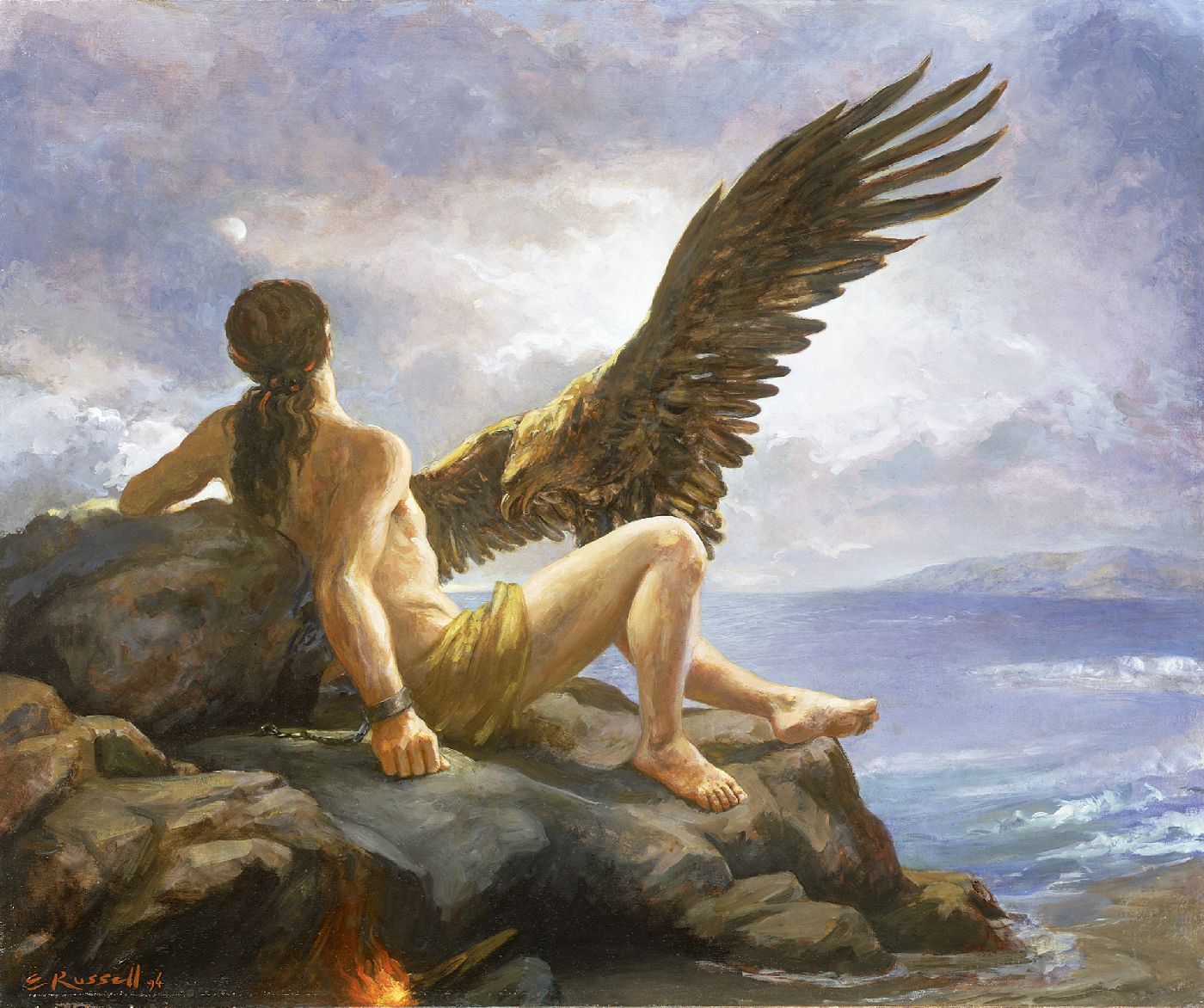
Prometheus Again
I once tried to paint in oils and egg tempera a painting of Prometheus. My titan was gaunt and almost skeletal, quite unlike some of the renderings I’ve seen of him as a buff gay icon. He faced the viewer in horror as his back was turned to the approaching liver-snatching eagle, which I modelled on the steppe eagle rather than golden. I’d gotten through about three or four glazes before I decided to give up—the drawing was wrong, especially of the man.

The reason I’m thinking about Prometheus again is because of the liver connection. Today I chanced upon a contemporary artist, Elsie Russell, who has clearly put some time into this subject.
I’m always enchanted when I find artists working today who have a) some grasp of drawing and anatomy and b) an interest in their historical artistic and cultural heritage, along with the talent to explore these in a new way. It’s possible in some cases to write this off as postmodern trendiness, though why that’s worse than modernist trendiness I’m not sure. (Notice that a lot of the artists who rail against drawing well, calling it “illustration,” are the ones who can’t draw for beans, like David Hockney.)
Classical myths endure because they tell us something fundamental about the human condition. I suppose I’m entering a phase where I’m willing to try and work out what this particular one might be for me. Regeneration? Endurance? Being punished for doing the right thing or for knowledge? In this dark time of the year in the northern hemisphere, images of light are particularly appealing to me. In this dark time we are entering for the world, how much more appealing they become. How much more worth the defiance of authority, even when those who benefit from the great act are unworthy or worse, ignorant.
Liver. Live. Love. Fegato. Fe. Foie. Foi. Higado. Hidalgo.
Live.
19 December 04
The Scourge of Arial
A brief history of the parasite font that dates from around 1989. There is also a sidebar highlighting the differences between Arial, Helvetica, and Monotype Grotesque 315, Arial’s ancestor.
14 December 04
Letters of Complaint
 Inspired by Natalie of Blaugustine’s recent complaint regarding some boots she’d bought that didn’t, um, work out, I decided to send in a letter of complaint to Canson, a French paper manufacturer whose American subsidiary is based in South Hadley, Massachusetts.
 The substance of my gripe is that some layout bond paper I bought for calligraphy is defective, or rather every other page is. This every other page bleeds when ink is applied. I won’t go into the paroxysms of how this feels when you’re trying your hardest to render the perfect Roman capital “Q” and it fuzzes out like wine on cotton wool, but basically I’m not happy. I have suggested in my “letter,” above, that this might have been a fluke, a bad pad of paper. I’m not going back to Berkeley to try to return it; you can’t buy this stuff in Davis or even Sacramento.
My hope with such a missive is that they’ll fix it, or at least be aware that we’re going to notice if they start cutting corners, quality-wise. At worst they’ll throw it in the bin, but I’ve been gentle: maybe they won’t.
Maybe, Natalie, they’ll give me store credit?? Hah.