21 June 26
The Day In Its Color
While browsing in the public library several days ago I ran across a photography book from 2012 entitled The Day in Its Color: Charles Cushman’s Photographic Journey Through a Vanishing America by Eric Sandweiss, a historian at Indiana University. This book describes a remarkable collection of photographs taken between 1938 and 1969 by an amateur photographer named Charles Cushman. The title of the book comes from a line in a poem by Wallace Stevens; the collection consists of 14,500 Kodachrome slides of Cushman’s travels across the United States and a bit abroad. Cushman was a businessman with a lot of opportunity to travel, and he meticulously documented his journeys with his Contax II A rangefinder camera loaded with Kodachrome. This was a time period when most professional and much amateur photography was done in black and white, and color documentary photography was pretty rare then. As such, the collection provides an unusual glimpse in full color of the vernacular landscape of the United States at mid-century. Cushman showed little or no interest in fine art photography, but he had a good eye for composition.
Charles Cushman was an alum of Indiana University, and several years before he died in 1972 he arranged to have his photography collection together with his thorough notes (he recorded the subject and exposure details for every slide he took) donated to the archives at the university. There they sat until 1999 when an archivist unearthed them and realized their value to documentary history. The library got funding to digitize the collection, and all 14,500 slides are available to browse online. Cushman moved to San Francisco in 1953, and I have found it fun to search in the collection for slides of places I know in California.
19 June 26
Out of Gamut
Today Ryan Moulton posted a good article about the colors your screen cannot show you and where to find them in the real world. Computer screens mix colors from red, green, and blue primaries but there are many colors the eye can discern on the color chromaticity diagram that fall outside the triangle defined by the three primaries. Mostly these are greens and cyans.
Moulton provides a guide to where to find these colors in the outdoors. Looking up at the leaves in a deciduous forest glowing in sunlight is one place. The light passing repeatedly through the leaves has the red and blue wavelengths filtered out leaving a pure spectral green at a wavelength of around 550 nm.
Another place is sunlight through depths of pure water. Water rapidly absorbs reds, and if sunlight passes through a few meters of water the color shifts outside of any screen gamut. These colors can be seen from shore when the light reflects off of light sand on the bottom, or from underwater.
Birds and butterflies famously can have intense iridescent colors thanks to the structure of their feathers and wing scales which can have elements that have the same length scale as wavelengths of visible light. Examples of these include peacock tail feathers and butterflies in the genus Morpho.
One needn’t visit nature to find colors that cannot be displayed on a screen. Green traffic lights have a color that falls mostly outside of displayable gamuts. This color has been chosen so as to provide the biggest discernment from red for viewers who are red-green colorblind. Traffic lights nowadays use LEDs which can have quite pure spectral colors.
(Thanks to MetaFilter for the link to the article.)
17 June 26
Seeing in Black and White
 Every now and then I get inspired to take photos in monochrome with my everyday carry camera. This makes me view the world in a different way, looking for strong contrasts in value and interesting patterns. Black and white photography can point on one hand towards the visually more abstract and on the other hand towards capturing the essence of interactions.
This image from my recent spell of monochrome photography shows the wall of a nearby church building. It is an example of a black and white photograph that does not work at all if it was in color. What one would see in color is a literal wall of red, overwhelming the image’s patterns.
15 June 26
Drawing Signs
 One of my favorite photographers is Walker Evans, who was a master at photographing the American vernacular landscape. We were fortunate enough to see an exhibition of his work at the San Francisco Museum of Modern Art eight-and-a-half years ago. There is a collection of his work published in 1998 that is entitled simply Signs and consists of 50 photographs he took of signage across America.
Signs are important in forming the character of an urban landscape. I was reminded of that a couple days ago when I read through The American Dream? and enjoyed all the illustrations of signage along Route 66 sketched in pen and wash. I decided I needed to sketch more signs, so yesterday I drew the building shown here at left. This hair salon is on G Street in Davis, on the opposite side of the street from the Davis Food Co-op.
13 June 26
Russell and A
 Here’s my sketch today of the house at Russell Boulevard and A Street in Davis looking across from Russell. This is right across the street from campus; in the lower right corner of the sketch one can see light towers on a campus playing field. The house belongs to the Chi Omega woman’s fraternity.
Pica has a good collection of graphic memoirs on our bookshelves, and looking for something to read there late this morning I found a copy of The American Dream? A Journey on Route 66, by Shing Yin Khor. A lovely little book chronicling a road trip the author took in April 2016. I was heartened to see the technique the author uses for their illustrations which is similar to the way I’m sketching now. There are three layers in their illustrations — an underdrawing in blue colored pencil, black ink line work. and watercolor washes. I’m finding I really like having an underdrawing before putting in the ink line work.
7 June 26
For Lease
 Here is yesterday’s urban sketch. This is the northernmost corner of the retail mall on G Street north of the Davis Food Co-op. Three of the nine spaces in this mall are vacant, though it does contain a good bike store and our favorite local bakery.
30 May 26
Radical Cartography
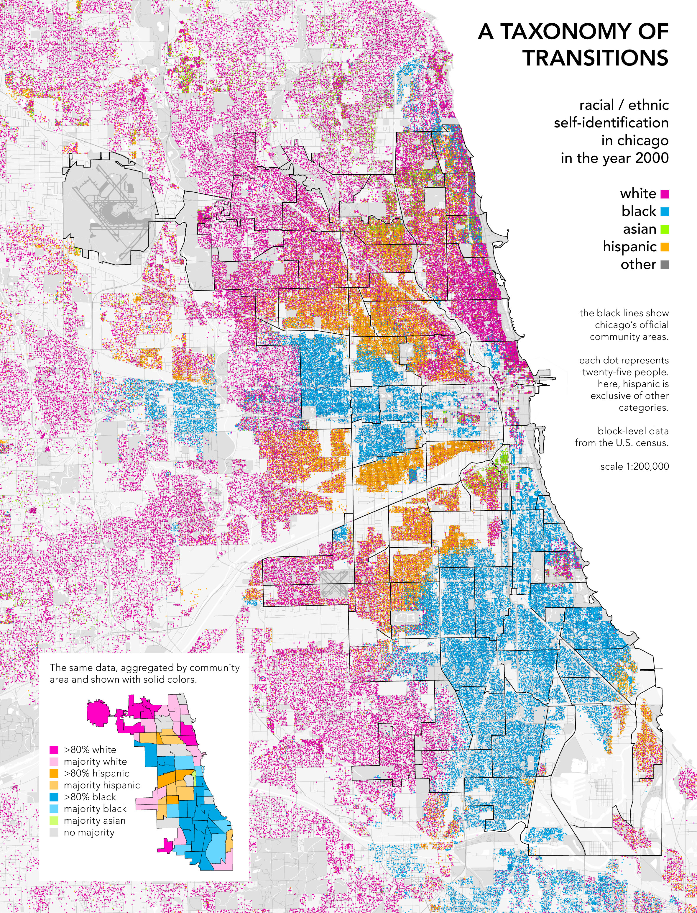
One of my habits is stopping by the public library briefly and seeing what is on their new book shelf. This past Tuesday I found a copy of William Rankin’s new book Radical Cartography: How Changing Our Maps Can Change Our World and didn’t hesitate to check it out. Bill Rankin is a historian of technology and the geographical sciences at Yale University. He has been experimenting with cartographic techniques for a couple of decades now and has kept up a library of his projects at the site radicalcartography.net.
To Rankin radical cartography is not so much about the politics of the theme, but rather getting away from the conventions of mainstream cartography with its emphasis on neutrality, deference to data, and aspirations towards a single interpretation. Instead he proposes fostering the values of uncertainty, subjectivity, and multiplicity.
An example of this is Rankin’s work on mapping ethnic self-identification in Chicago. There is a long history of mapping ethnic neighborhoods in Chicago dating back to the 1920s. The maps of these patterns got reified into community areas which became the way Chicago understands its own geography. Rankin’s map illustrates that the transitions between many of these community areas are a lot more gradual than the “jigsaw puzzle” mapping of the areas would suggest. His technique in this map is to do fine-scale dot mapping: each colored dot represents 25 people of a particular ethnicity. This contrasts with shading the entirety of the community area with a color representing the majority ethnicity.
The book is organized by seven different elements of cartography: boundaries, layers, people, projections, color, scale, and time. As somebody who has done a fair amount of cartography professionally, I learned interesting concepts in all seven of the sections. Some of Rankin’s approaches run against my instincts, but that is part of his message, and there are techniques I’d like to experiment with. I’d definitely recommend the book for map lovers and geography students.
28 May 26
Feral Potato
 As Pica mentioned yesterday, she unearthed some volunteer potatoes growing from soup leavings used as compost for one of the flower beds. Here is a sketch of one of them.
Lately I have been using black ink in my pen and wash sketches — for some reason I want strong contrast in my linework right now. This is sketched with De Atramentis black ink in a medium Pilot Metropolitan fountain pen.
24 May 26
Craft Fair
 On Sundays twice a month the Davis Craft and Vintage Fair takes place in Central Park. It is pleasant to wander through, and there is almost always live music at one end of the concourse. Here is a sketch from today of one of the stalls.
22 May 26
Drying Days
 It reached 95° F today with 26% relative humidity. These are good drying days. But if you are neither a) drying your clothes on a line outside or b) a watercolorist this may be an unfamiliar concept. How rapidly do wet materials dry given the present combination of relative humidity and wind speed? It doesn’t seem to feature in weather websites in the United States, though I did a Kagi search on “drying days” and came up with a laundry drying guide for London. Today’s weather there was rated “Superb”.
I am now trying sketching experiments with layers where I am painting first with loose watercolors, and then drawing over the watercolor with my Derwent drawing pencils. This calls for good drying days, since the paper needs to be perfectly dry before drawing on it. Here is a sketch I did earlier today in this manner of our laundry on the drying rack.